ARTIST SPOTLIGHT: PETER PAID
IN CONVERSATION WITH BROOKLYN-BASED ARTIST PETER PAID
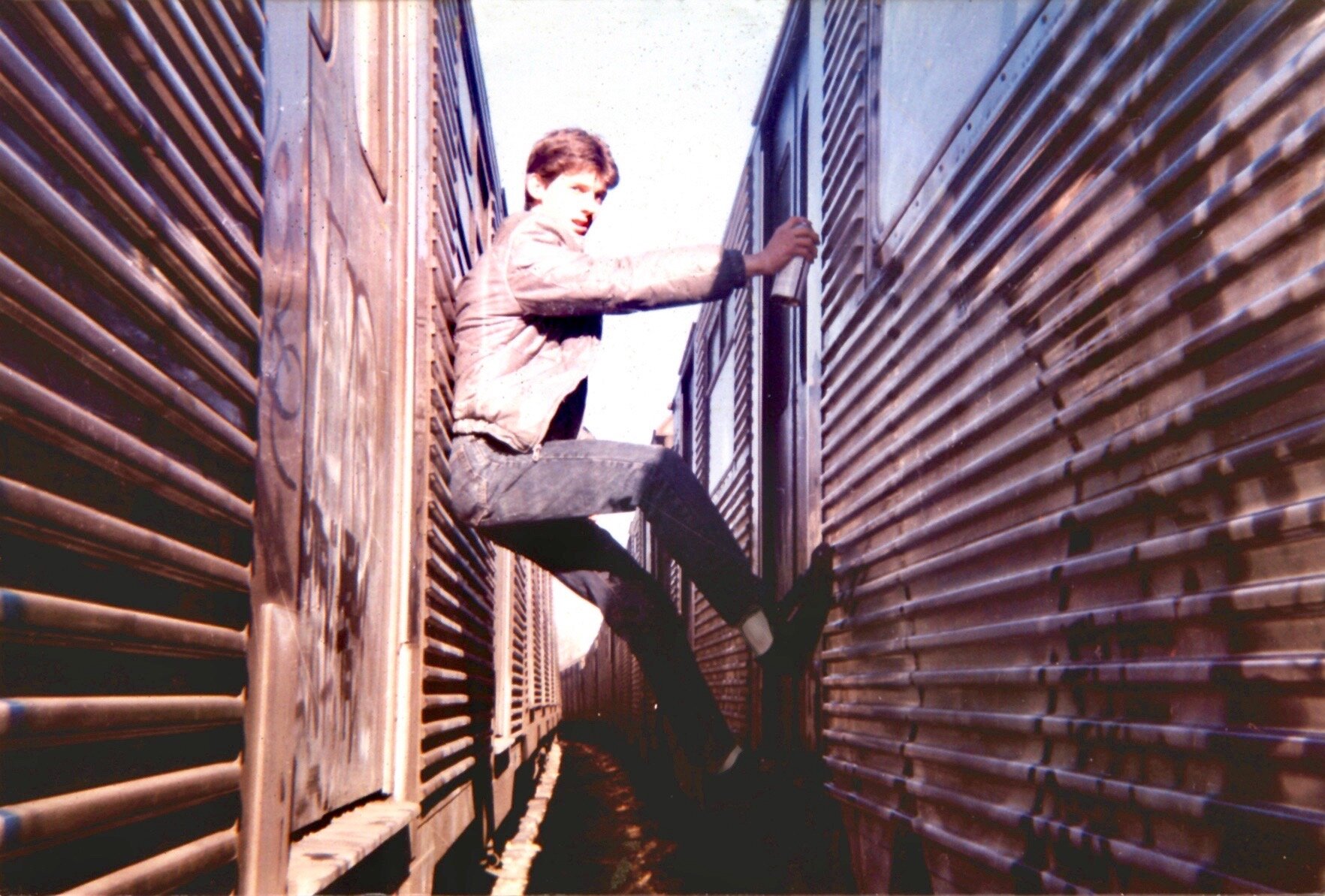
Get to know the art master who went from doing graffiti on subway trains, to opening up his own sign shop and exhibiting his work in various places including New York's Beyond the Streets in 2019 during his residency.
Lexical signs are seen when studying the work of poet and performative artist John Giorno, known for his text based canvases; or Ed Ruscha's early works influenced by phrases seen in advertisements; or even while understanding the works of designers Milton Glaser and Barbara Kruger who reinvented the wheel in logo making; signs are everywhere - most in which are reimagined into popular culture by such commercial artists. As we're now in a more digitized world, the rarity of hand-lettering is overstated, but for artists like Peter Paid who continues to make hand painted signs, carries the legacy of a meticulous craft that for him, dates back to his early years in writing graffiti. Paid has hand painted tens of thousands signs that span from commercial signage to album covers to paintings on canvas. In his most recent body of work, the artist is working on fine art recreations of iconic New York City signage on canvas, in homage to the old school style of signwriting that made up the city's buoyancy.
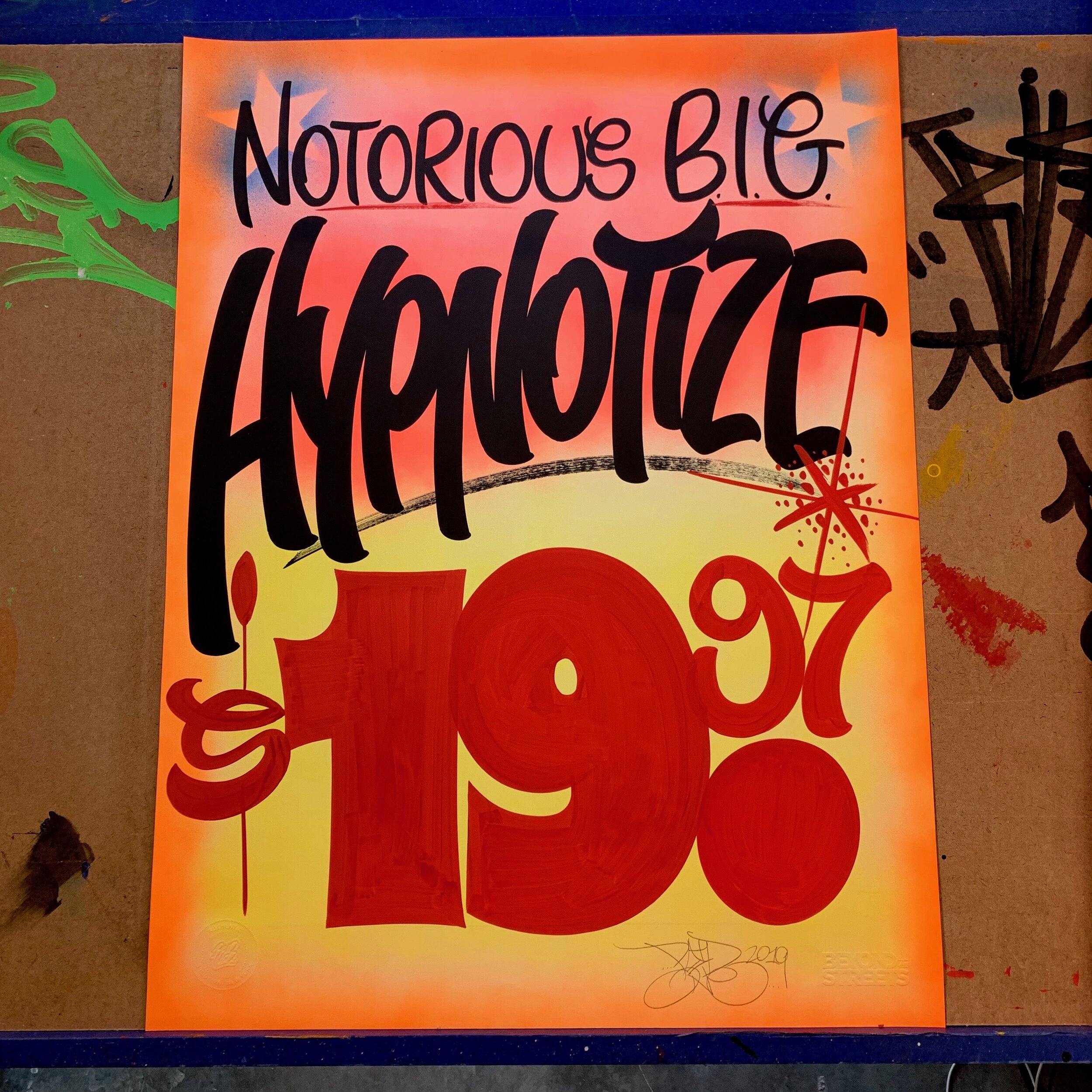
Perhaps some of his most notable works can be found inside the Brooklyn Firefly restaurant in Bay Ridge. The restaurant's walls are adorned with music title signs on canvas. Paid's works aren't always limited to canvas though. He sometimes takes an old school approach, and paints on butcher paper. Arches and Coventry Rag vellum paper are popular choices as well. Taking viewers back to again, the old school way, some signs read "James Brown, Funky Drummer, $19.70" (the dollar amount representing the year the song was released) or TKA's "Maria, $19.92" while others elegantly cover the entire canvas with lyrical phrases like Spread Love It's the Brooklyn Way or Groove is in the Heart - a close tie to one of his passions, music and DJing. Beyond this, Paid has exhibited his work in galleries such as 212 Arts in the East Village and plans to show more of his work whenever it's safe to, again - post COVID. As you might have guessed already, Paid was born and bred in Brooklyn, where he now reflects on how his upbringings have influenced his artistic trajectory in our interview below.
(Q) At glance, sign painting can seem easy, but there are so many technicalities behind the art. Can you explain your work and process?
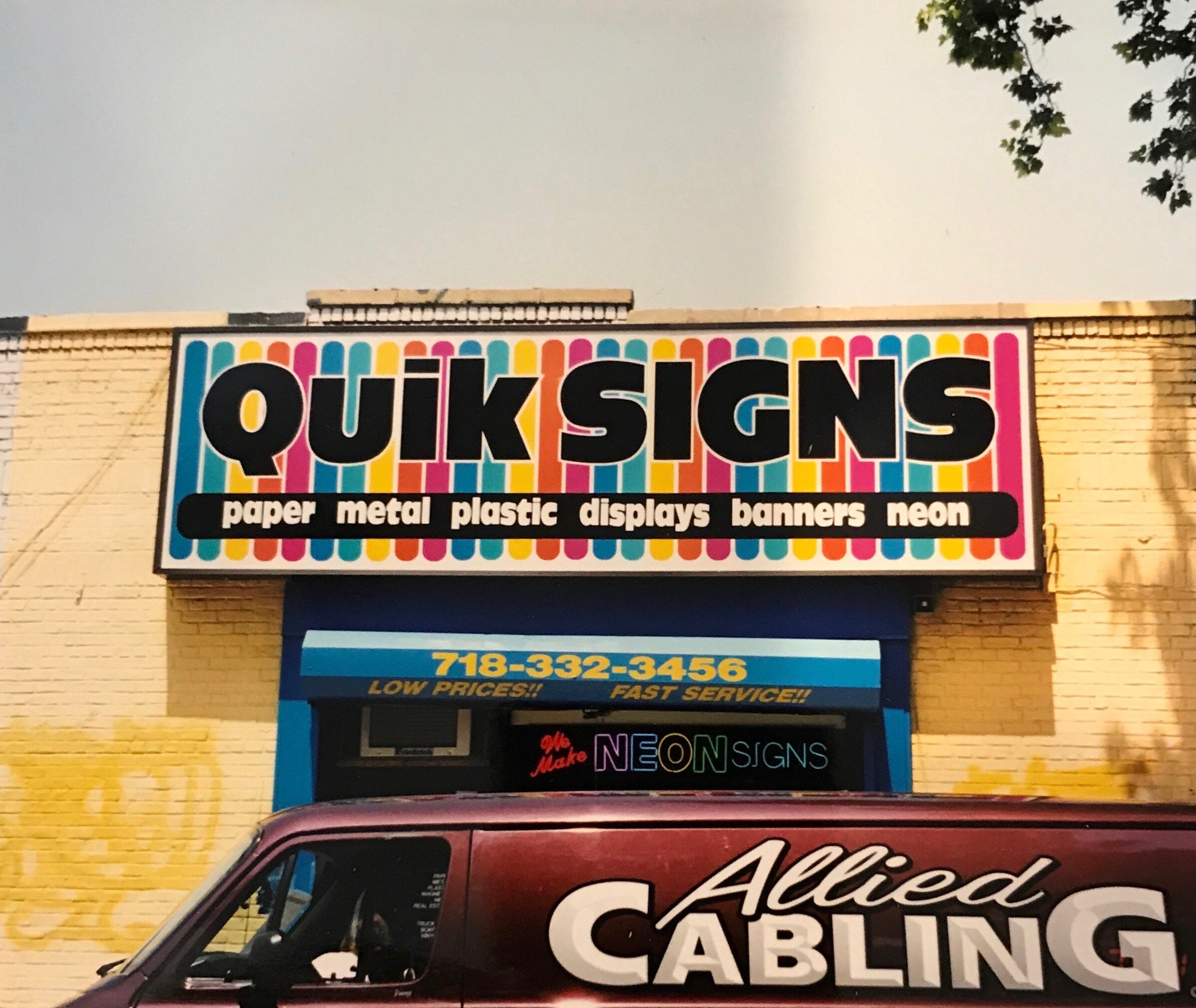
At its core, my process is traditional. I learned pretty much the same way most (if not all) sign painters learned. i.e. Lay out your design following strict and exact measurements. Meticulously illustrate exactly where your lettering will be, and in the exact fonts you're going to use. Drawing out each letter perfectly, including thin and thick strokes, serifs, etc. When it comes time to hand letter the sign, you'd fill in exactly what you laid out. There are times with my artworks that I will use that method. MOST of the time I don't. I'll explain why. Back in the 1990's when after working in a few local sign shops, I branched out on my own and opened up my own sign shop. In order to not only stay competitive, but to succeed, I NEEDED to come up with ways to separate myself from the dozen or so other local shops competing for work. I decided that the quality of work was one, speed was the other. Let's say you owned a sneaker store, grocery store, or you were a butcher. It wasn't at all uncommon back then for you to place your paper "sale" window sign order with a local shop, and have it take 2-3 weeks to be completed. I knew that if I could give a quality product, with a faster turnaround time than anyone else, more often than not, I'd get the work. And I did. Quik Signs (the name of my shop) was born. Following the old adage, "time is money" I not only had to train myself to paint faster, but I knew I could save A LOT of time on laying my work out, if I did a loose sketch, as opposed to a full-on traditional layout. So on my 4' x 16' drafting table, I'd roll out (for example) 36" fluorescent yellow paper. I would go through all of my orders for the day and anything that was to be done on that color paper that I could fit, I would "gang" together. Using vine charcoal and a wooden yardstick, I'd quickly and loosely lay out each sign. The layout would be done fast enough where I had just a general idea of what was going to be painted where. If while laying out a word that was going to be tight towards the edge of the sign, I could "cheat" a little with certain letters. Letters such as L or E, if needed, could be shortened just enough where it isn't noticeable. So now a cramped, tight looking word, (CLEARANCE for example has three cheatable letters) doesn't feel so condensed, or smashed together. Learning that, and adopting it into my laying out style, I was able to speed things up considerably. Also on my work cart, I would always keep a cup of black, bright red, and ultra blue 1 Shot poster paint ready to go, alongside a section of the Yellow Pages that I would use as a palette. I'd take the palette, cup of paint, and a brush, and plop it down alongside the first sign I was to begin painting. I built my drafting table with just enough of an angle where when I laid my palette and paint cup down, it wouldn't slide off the table. As each sign was painted, I'd slide the palette over and go on to the next one, without ever missing a beat. In using such a loose layout, and not adhering to traditional strict letterforms, over time I developed what is my own signature hand style. I found that my lettering would have a "bouncy" feel to it by exaggerating some ascending and descending letter strokes, which came naturally.
(Q) Tell us more about this new series you're working on?
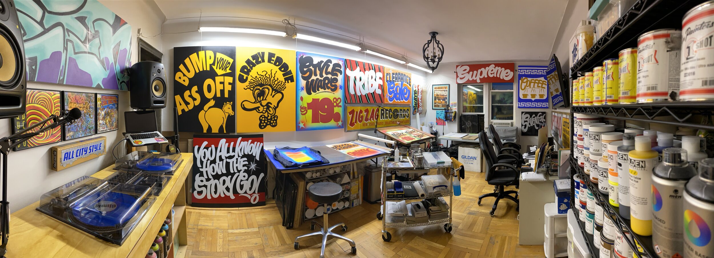
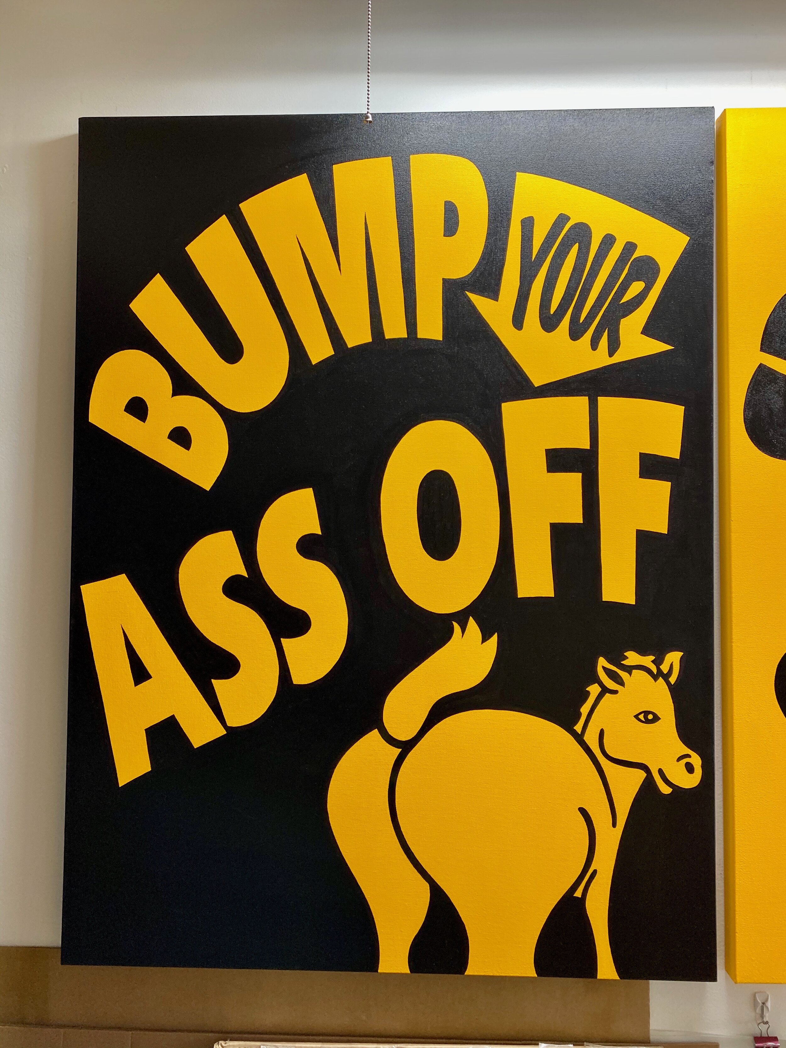
When I had my sign shop Quik Signs, I had a couple of clients that owned rides and attractions in Coney Island. Around 1997, because they were old and worn, I was hired to remake the original Eldorado Auto Skooter's "Bump Your Ass Off" signs. As a child, I remembered seeing those signs hanging above the entrance to the bumper cars, (I recall seeing the word "ass" on a sign was an exciting moment for me) so to be hired to remake them - I was thrilled. Fast forward twenty plus years, those two signs are STILL hanging today. As part of this new series of works, I recreated my original artwork on canvas as a tribute to those signs in that era. Currently, I'm working on a series of fine art recreations of iconic New York City signage. Since the advent of technology, and the ability to design and produce signage digitally, I believe commercial signage has lost the personal flair that each sign writer would bring when lettering traditional hand-painted signs. With my works in this series, I'm telling the story of my youth through the lens of a native New York sign painter.
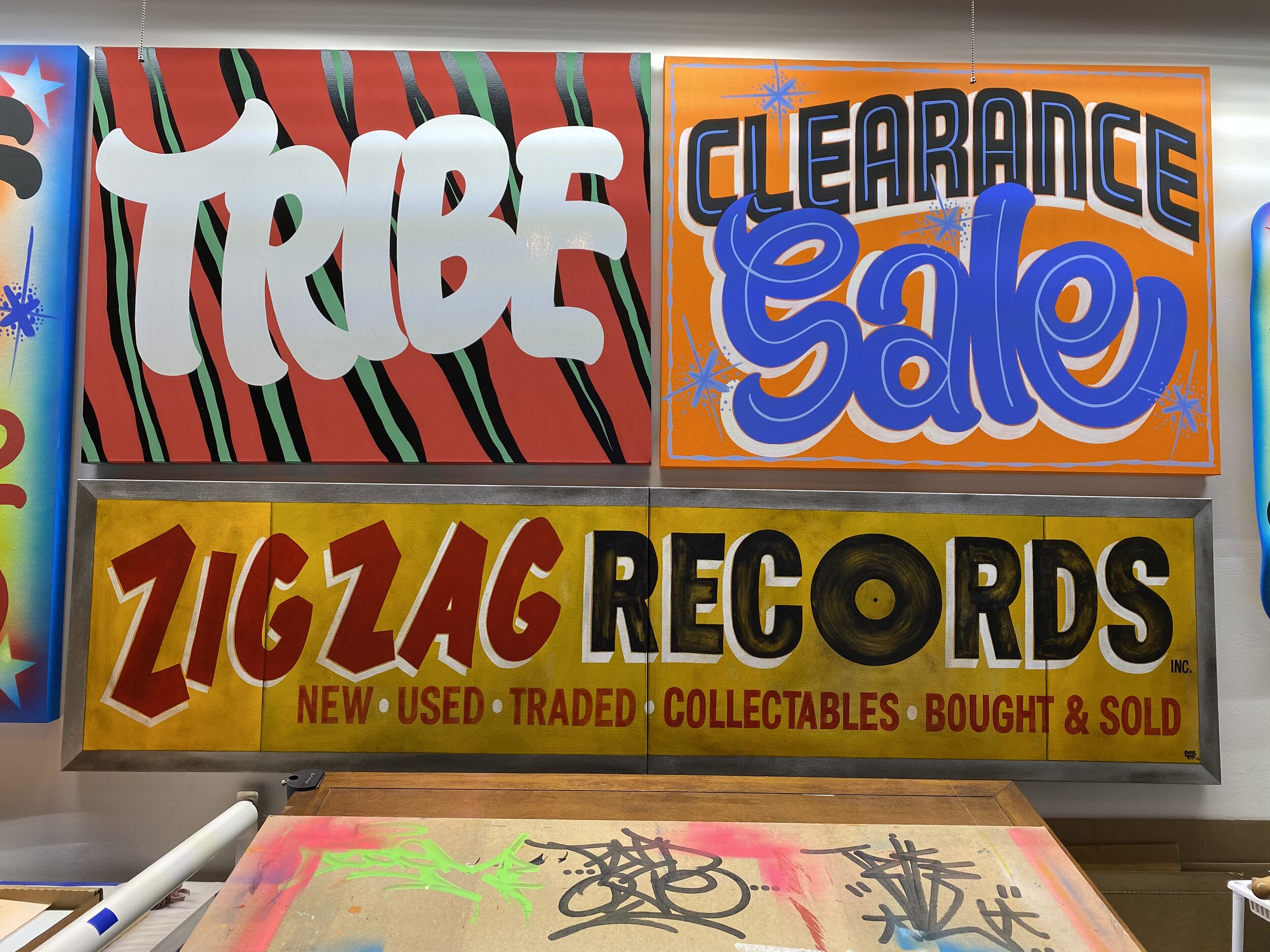
(Q) Would you say that's your favorite sign? Having painted signs for 30 years, the majority of the work that I've done would fall into the category "done to pay the bills." However, I've definitely had some that when after finishing, I stepped back, looked at it and would say to myself "now THAT shit is dope!" Though I don't have one specific favorite, I've had many that I truly loved the way they came out. One of the early ones that does stick out in my mind was "Sea Serpent." This was a completely contour-cut by hand, multi-layer Sintra (composite PVC/foam) sign I painted for a children's roller coaster in Coney Island. I really wish I had photos of that one. Another would have to be the original "Bomb The System" and their re-name, "Scrap Yard" signs. For both of those, I took a Sharpie marker and did both of those tags on paper. I had to design them in clearly a "graffiti" style, yet readable enough to be used as a commercial sign. I scanned the handwritten tags into my computer, vectorized the art, did a full-scale pen plot, to which I spray glued them down to sheets of 3/4" thick MDO. All of the lettering was then hand cut with a jigsaw, and painted with 1 Shot black lettering enamel, and when dry, mounted to a brushed aluminum awning. More recently, as part of the series of recreations I'm working on, just before the pandemic hit, I completed a diptych of one of south Brooklyn's iconic "Zig Zag Records" signs.
This piece is done on two 20" x 40" canvases, finished at 80" wide, completely hand painted in acrylics, which is something I'm not entirely used to. Traditional oil-based sign enamel is a completely different type of paint. From the way it lays down, the way it feels on the brush when painting, the way it covers, etc. It's as different as comparing oil paint to water colors. Because of this difference, and my lack of experience with it compared to lettering enamels, this artwork was a challenge for me to recreate. Not only because of acrylic paint being a less familiar medium, but because this was an old, faded sign, that I needed to "weather" convincingly. I absolutely love the way it came out.
(Q) When did you learn you had a talent for painting signs? In the late 80"s through early 90's I was DJing nightclubs throughout NYC. Still living at home, my mother insisted that I have a "real job" as being a DJ and coming home in the dawn hours was not a sustainable way to make a living.
In conversation with a friend of mine who had just started a job as a helper in a small, neighborhood sign shop, he suggested that I stop in and see if the owner would hire me as well. So, I went in the next day and met with the owner. It was about as informal of an interview as you could get. During which, he asked if I had any artistic ability. I replied that I had attended the High School of Art & Design, and have been interested in art since I was a little kid. He walks me over to a large drafting table, rolls out some paper and hands me a pencil and says "draw me something" and he walked away. I froze. I'm standing there practically snow-blind from this giant field of white paper in front of me. As I'm staring at it, the only thing I could think of to draw was a graffiti-style character, (or "mug" as we used to call them) holding a sign that read "Signs." Once I finish, I call him over, he takes a quick look at it, turns to me and says, "Be here tomorrow at 8am."
Though I loved the challenge of learning how to do hand lettering, my early attempts were horrible! The first few months there, every day, in my head I was saying to myself, "this is the day he's going to fire me." I think the frustration of trying to pick it up quickly, and not being able to, was showing, because one day he walks over to me and tells me to "just relax", "No pressure. If you make a mistake, crumple up the paper, roll out some more, and do it again." Though my lettering "skill" didn't instantly get better, my ability to relax and not worry that at any moment I'm going to be fired, the confidence to control the brush a little better did increase. It was at that point where I felt I was truly on my way.
(Q) Where did you exhibit your works last? Do any galleries represent you at the moment?
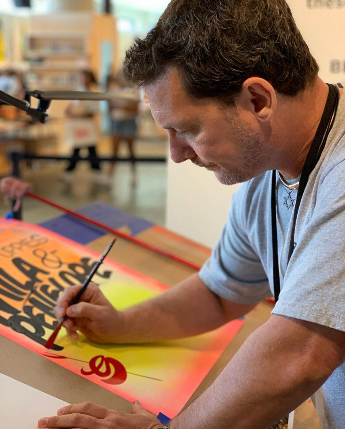
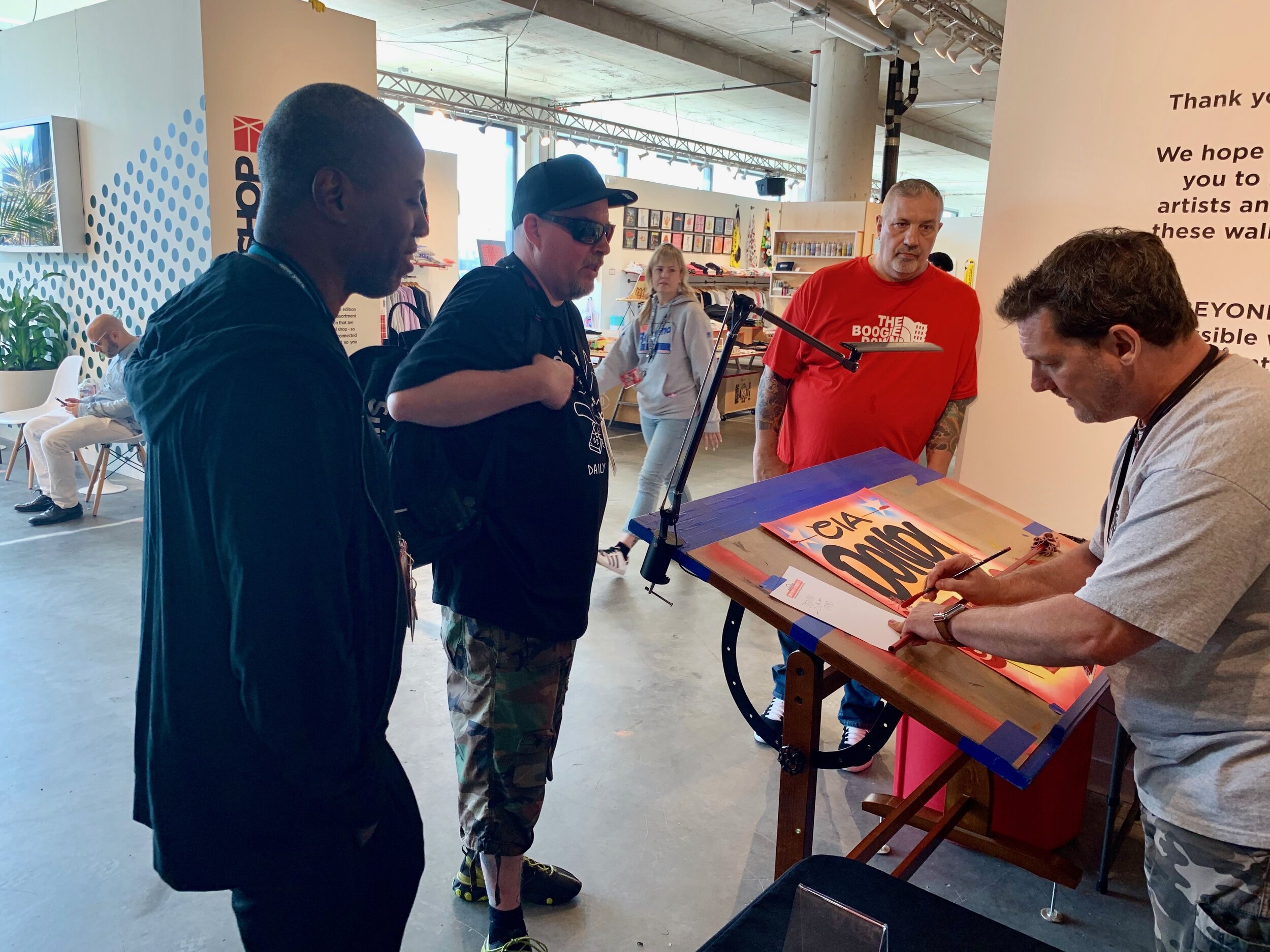
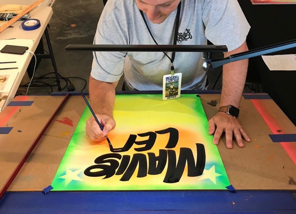
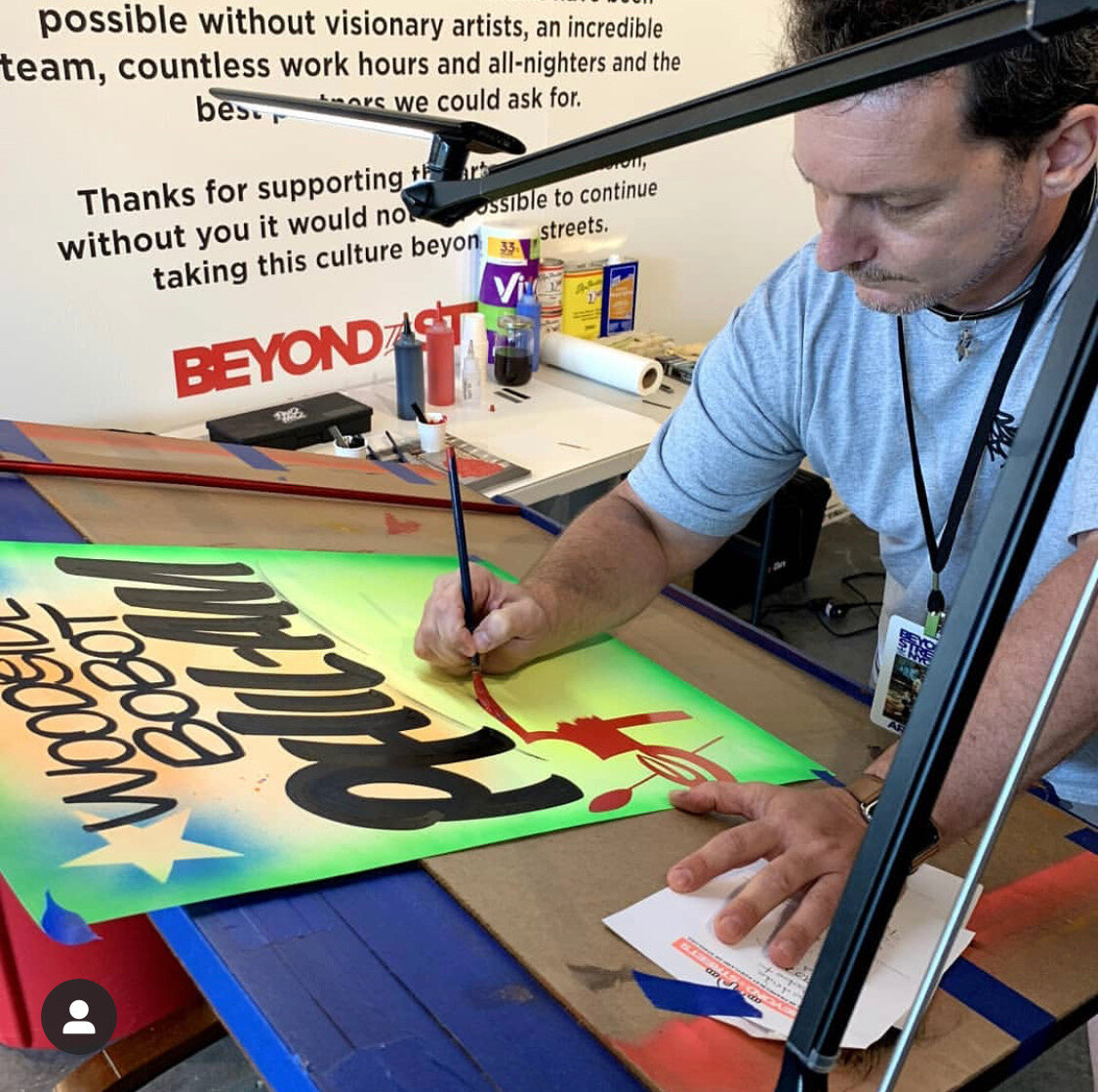
My last solo show was August 2019 at 212 Arts in NYC's east village. Followed up by a multiple-day residency throughout the summer at the New York installation of Beyond the Streets, where I was hand-lettering custom paper signs. To be part of that event was incredible! Not only meeting, but befriending so many legendary artists and contemporaries in the graffiti, and art world was truly awe-inspiring. I've been part of a handful of group shows since my solo show at 212 Arts, and have a few others coming up. I had a month-long exhibition scheduled for this past May 2020 at WallWorks NY, and a two-week long show at Golden Hands Gallery in Hamburg, Germany this summer. Both had to be put on hold since the Coronavirus pandemic hit. We're in talks for re-scheduling once things get back to whatever our new "normal" is.
(Q) Who influences you and your craft? Are there any hand-lettering artists you look/ed up to?
Early on as a sign painter, the first mention has to be Mike Meyer. I don't think there is a sign painter around who isn't a fan, and wasn't influenced by his work. If you're not familiar, google him. I'm fortunate enough to be able to call these two gentlemen my friends - Eric Haze and Cey Adams. Both of these legends started as graffiti writers, who not only transcended subway bombing, and gained success in the worlds of commercial and fine art very early on, but also having incredibly influential and robust careers spanning decades. And, they are both still extremely relevant today! If there was a Hall of Fame for contemporary art, both Haze and Cey would be inducted.
(Q) And lastly, what's the most important take-away behind your work?
I feel that what is most important is keeping alive a dying art, by being original and authentic.
